
Quadem Digital Brand Identity
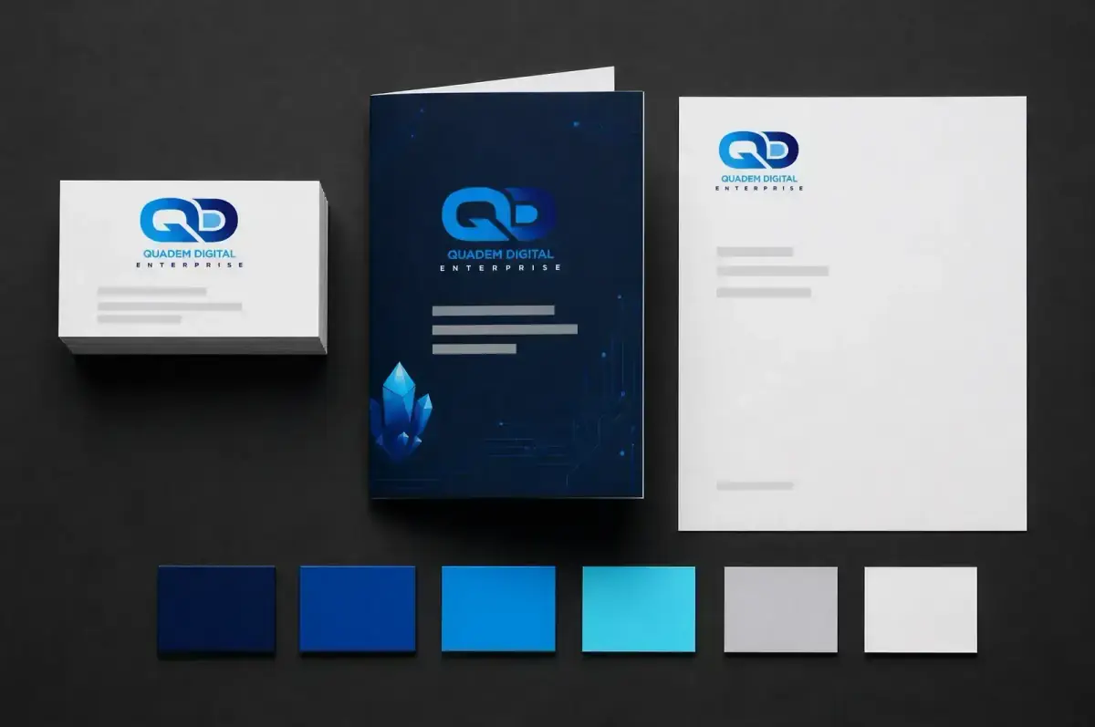
The identity I built for ourselves: the QD monogram, a navy and blue colour system, a Space Grotesk and Inter type pairing, and the collateral it all runs on.
The brief I set ourselves
Quadem Digital needed one identity that could carry a dark, technical website and still hold up printed on a card. One mark, one colour system, one type pairing, applied the same way everywhere, so the brand looks like the same company whether you meet it on a phone screen or across a table.
The mark
The QD monogram links the two letters into a single continuous loop rather than setting them side by side. It survives scaling down to a favicon and up to a tote bag, and it works on white or on navy without needing a redrawn second version.
Colour and type
The palette is anchored on a deep navy, with a bright blue for accents, links and calls to action, and a light grey and white for surfaces and copy. Headings are set in Space Grotesk and body copy in Inter, the same pairing running across quademdigital.com today.
The system applied
Shown here across business cards, letterhead and envelope, branded merchandise, and social post templates, alongside the guidelines board that fixes the palette and typography so anyone applying the brand gets the same result.
A note on this project
This is my own brand, not client work, which is why it carries an Internal badge. I am showing it because it is the clearest example of how I approach an identity: define the mark, fix the system, then prove it across every surface the business actually uses.
From the project
5 imagesWant the same thing done properly?
Tell me what you are building and what is in your way. I will tell you what it takes, in plain numbers, before you commit to anything.
Start a conversation